.png)

is the tool for managing your journey through Dialectical Behavioral Therapy (DBT)
A Case Study by Elizabeth Kupchella
Roles: UX Design | Product Design | UX Research | Back-End Development
Resources: Figma | Jira | Miro | Buzzy | Glide | XCode | FaceTime Calls From My Mom
Comprehensive View
Concise View
Condensed View
Obstacle
Opportunity
Approach
Dialectical Behavior Therapy (DBT) requires a client to manually track their emotions, the intensity of those emotions, their behaviors, and their theraputic skill use every day for a year.
Traditional paper diary cards can be easy to forget, and a digital diary card typically exists as a spreadsheet, more commonly referred to as The Last Thing You Want To See Before You Go To Bed by most pulse-having folks.
A mobile-first DBT diary card app designed to simplify and encourage daily skill tracking. It allows users to log emotions, behaviors, and DBT skills quickly and intuitively, review skill definitions, and export data for use in therapy – all in one discreet, user-friendly tool.
Optional therapist-linked features support accountability and structured reflection.
The app was designed with a trauma-informed, accessibility-focused lens and draws heavily on direct DBT materials and peer-reviewed research.
I conducted a competitive analysis of mental health tracking tools, mapped user flows for key behaviors, and am prototyping screens in Figma where I'll test user flows with heat maps and Maze. The UI emphasizes calm and clear digital minimalism for daily use.
Dialectical Behavior Therapy (DBT) requires clients to track emotions, behaviors, and skills daily for a year, but paper diary cards are easy to forget, and digital ones (like spreadsheets) are cumbersome, hindering reflection and insight.
A mobile-first DBT diary app that simplifies and encourages daily tracking. It allows users to log emotions, behaviors, and DBT skills, review skill definitions, and export data for therapy— all in a discreet, user-friendly tool. Therapist-linked features can support accountability and reflection.
Designed with a trauma-informed, accessible focus, based on DBT materials and research. I’ve conducted a competitive analysis, mapped user flows, and am prototyping screens in Figma, using heat maps and Maze for user testing. The UI emphasizes calm, minimal design for daily use.
DBT requires daily tracking of emotions, behaviors, and skills, but paper and digital options are often forgettable or overly complex.
A mobile-first DBT diary app simplifies tracking and reflection, while supporting therapy with easy data export and optional therapist-linked features.
The app is designed with trauma-informed, accessible principles and informed by DBT research, with user testing via Figma and Maze.

Research
While transitioning into UX alongside full-time and part-time work, I didn’t have the capacity to run a HIPAA-compliant research study for this project. Instead, I grounded my process in secondary research, DBT literature, current UXR practices, and proto-personas to guide early design decisions. I also got familiar with tools like Miro, Jira, Ethnio, dscout, and Lookback to better collaborate with future UXR teams.
Secondary Research
Assessment of current diary card options (paper, spreadsheets, and limited apps) revealed key findings:
Mobile diary cards improve engagement, enable real-time therapist-aligned tracking, support in-the-moment skill use, and increase long-term DBT adherence (+37 treatment days, +3 skills/week).
Competitive Analysis
My competitive analysis showed that most DBT apps focus on either learning or tracking, but rarely connect daily practice back to therapy.
BetterBrain's difference is that it connects daily DBT practice to therapy through contextual logging, coaching tools, therapist-ready exports, and personalized guidance. It uniquely supports both pre-treatment and Stage 3 care beyond the standard 12-month protocol.
Proto-Persona: Primary User

Sasha Ramirez
DBT Patient
Age: 27
Race: Latina (Hispanic)
Education Level: Some college coursework toward a Bachelor’s (currently enrolled)
Languages Spoken: English, Spanish
Family Status: Single; lives with a supportive roommate; limited close family nearby
Occupation: Student
“I want something that reminds me gently to check in, helps me stick to my skills without feeling like a chore, and doesn’t vanish when I most need support.”
Frustrations
Paper & Spreadsheet
Diary Cards
When I try to use a paper diary card, I honestly tend to lose it. When I use the Sheets app on my phone, it feels clunky, impersonal, and time-consuming to fill in during emotional distress.
Other Apps Aren't
Tailored Enough
Most DBT apps just track moods, feel clunky or clinical, and cost too much. None make it easy to reach my therapist or get reminders when I actually need my skills.
Goals
A Diary Card That
Moves With Me
Short, easy exercises and therapist touch points I can pull up fast when I need them the most, like a mindfulness tip, a skill refresher, or even a phone coaching session.
One Place for
All Things DBT
Managing a personal journal, spreadsheet diary card, and workbook is overwhelming, so I wanted one place that functions as a diary card, tracks progress over time, supports homework, and captures reflection.
Sasha represents a typical DBT user: introspective, emotionally intense, and motivated to grow, yet challenged by self-criticism, fear of abandonment, and emotion regulation difficulties; all core traits commonly seen in women with BPD.
Proto-Persona: Secondary User

Dr. Anika Deshpande, LCSW
Age: 38
Race: South Asian American
Education: Master of Social Work (MSW), plus post-graduate DBT certification
Languages: English, conversational Gujarati
Family Status: Married with one preschool-aged child
Occupation: Licensed Clinical Social Worker (LCSW), coordinator and co-leader of a full-protocol DBT program in a community mental health center
“I need a tool that gives me clear insight into my client’s week before we even meet so we can spend our session working on emotion regulation, not hunting for data about it"
Frustrations
Patient Engagement + Spreadsheets Don't Mix
Other Apps Lack In-Session Support
Asking a client to commit to three hours of therapy each week in addition to homework and daily logging is a lot, and spreadsheet logs clearly fall to the back burner. Clients usually have to complete the diary card in session because they just couldn't get to it, cutting into valuable therapy time.
Available DBT apps seem to only focus on tracking emotions and behaviors; current options don't seem to be a comprehensive resource for all the other parts of DBT (and there are tons), like skill overviews and homework reminders.
Goals
Insight Ahead of Session
Quickly view and interpret a client’s recent diary-card trends (e.g., skill use, urges, behaviors, emotions) before the start of session to better prepare our session agenda and areas of focus.
Client Empowerment
There are so many components to full-protocol DBT, and they all seem to be disconnected; I want my clients to feel like they have a home base for their journey through the program, so they can feel empowered when they see progress.
Anika is warm, organized, and deeply committed to her clients’ growth. I chose an Indian American therapist to move beyond the default “white, mid-30s female therapist” archetype while reflecting the growing diversity of mental health providers.
Primary Task Flow Journey Map
WTF?
(why this flow?)
It's the crux of the diary card: tracking. It happens daily, and any DBT app will likely be built around this flow; when this flow works, the DBT app works.
The image below is just an overview – click it to open a new window where you're free to zoom in on each chart component.

Iteration Spotlight: Trends + Summaries
This was one of my personal favorite design iterations in this app: rethinking how and when users receive summaries of their entries. Early designs asked users to opt into summaries on each individual tracking screen like this:
User completes tracking section
User prompted to save key info
Confirmation
screen

After Iteration
This series repeated after every completed tracking screen for each and every day – it was way too much.
Most users of a mental health app are dealing with psychological barriers to action before they're even introduced to an interface, I realized I created unnecessary steps when they least want to be on their screens.
I created a singular screen to appear the day of therapy with a comprehensive overview of spikes and highlights throughout the week.

Secondary Task Flow Journey Map
WTF?
(why this flow?)
I wanted to include the skills match quiz in my case study because it's an original idea (in the context of DBT apps) showcasing a unique and thoughtful approach to problem-solving.
The image below is just also just an overview – click it to open a new window where you're free to zoom in on each chart component.

Design System Selections
CTA Buttons

Typography

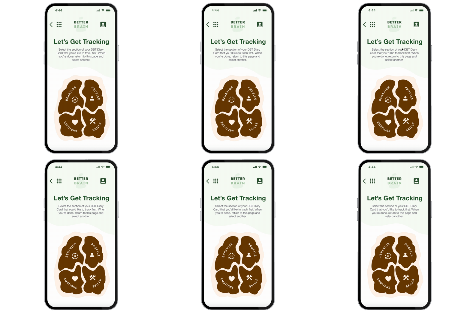
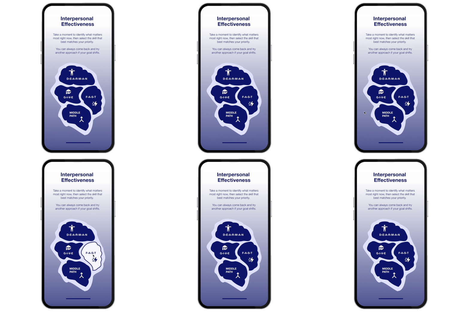
Custom-Drawn Brain Vector Menus
UI Highlight: the contouring of each menu item was individually contoured to look like sections of a brain, a really informative and difficult exercise in building a better UI skillset. The Blob Generator plugin is a Figma widget created by @k_kurakoa


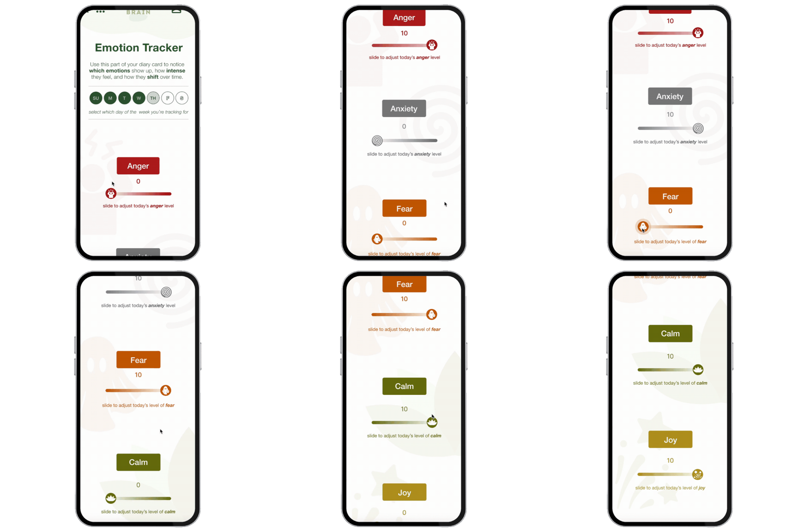
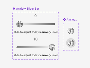
Slider Bars



Sticker
Sheet
Weight: 300
Style: Rounded
Grade: Normal
Fill: On

Fill: Off

Accessibility + Documentation
One of my priorities for BetterBrain has been putting accessibility at the foundation of my designs, not boxes to be checked after I've made my mockups. Here are some ways in which I've built upon my takeaways from earlier design systems and begun to understand what accessible design looks like beyond text size and color contrast ratios:
Focus Order
I explored how focus order shapes the experience for users navigating with keyboards or assistive technologies. By structuring interactive elements so the tab sequence follows the visual and functional hierarchy of each screen, I aimed to ensure that users who rely on non-visual navigation can move through tasks in a way that feels logical, predictable, and aligned with the intended flow.
Vision
Simulations
I also began incorporating vision simulation tools to understand how my designs might appear to users with different visual conditions, such as color blindness or reduced visual acuity. Testing screens through these simulations (via Stark Labs) helped surface issues that weren’t obvious during standard design reviews and pushed me to think more critically about hierarchy and information architecture beyond my own literal lens.

Outcomes + Reflections
My biggest takeaway from BetterBrain was that mental health tools aren't about collecting more data; they're about helping users make sense of the data they already have.
Many of the biggest design challenges existed before users even opened the app, often engaging with it during moments of distress. That insight shaped an experience focused on being exceptionally inviting, accessible, and intuitive.